Cane, copperand climate
Australian rum from Far North Queensland. Fermented on locally sourced North Queensland sugarcane syrup, distilled in one copper pot still, and matured in a barrel room that never gets a winter.
- Distillery
- Mt Uncle
- Region
- Atherton Tablelands
- Est.
- 2016
Australian rum, made where the cane is grown
FNQ Rum Co. is a single-still rum house at Walkamin on the Atherton Tablelands, an hour inland from Cairns. What is in the bottle is what came off the still: fermented on regional cane syrup, run through a copper pot still, matured in the tropics and recorded barrel by barrel.
One distillery
Every drop since 2016 has been distilled and matured at Mt Uncle Distillery, on a single 1500-litre copper pot still.
Cane, not refinery molasses
We ferment on cane syrup pressed from Tablelands cane within a week of the cut. Most Australian rum is fermented on molasses trucked in from a refinery.
Proof in process
Fill strength, cask, age and every sensory draw are recorded against the barrel, and published to a standard you can read.
Which bottle is for you
Five expressions off one still. Brightness runs inverse to age: Platinum is the light pole, the rare casks are the dark. Each card carries what it tastes of and what it is good for, so you can choose one without reading five dossiers.
Platinum
Cut cane, green banana leaf, white flowers, mineral.
Daiquiris and highballs.
RRP $75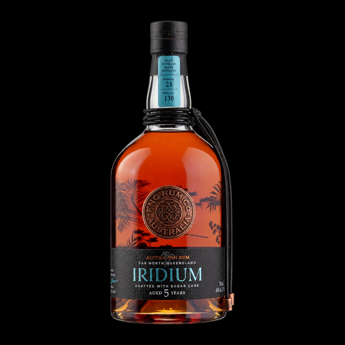
Iridium
Dried apricot, toffee, warm oak, cane.
A first aged rum. Neat, or an old fashioned.
RRP $85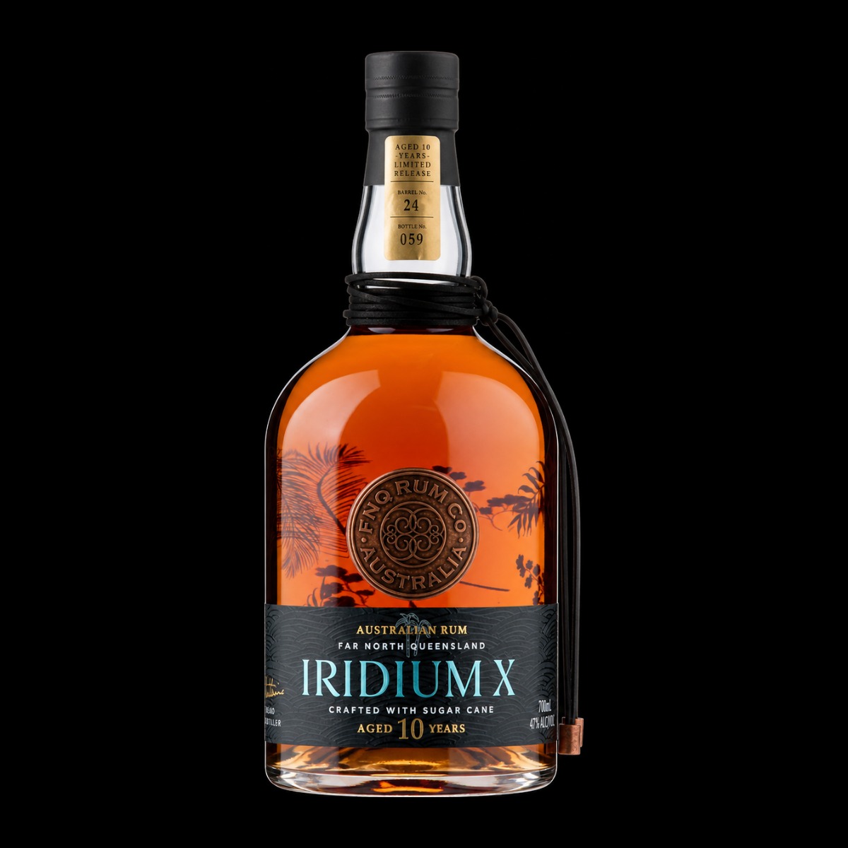
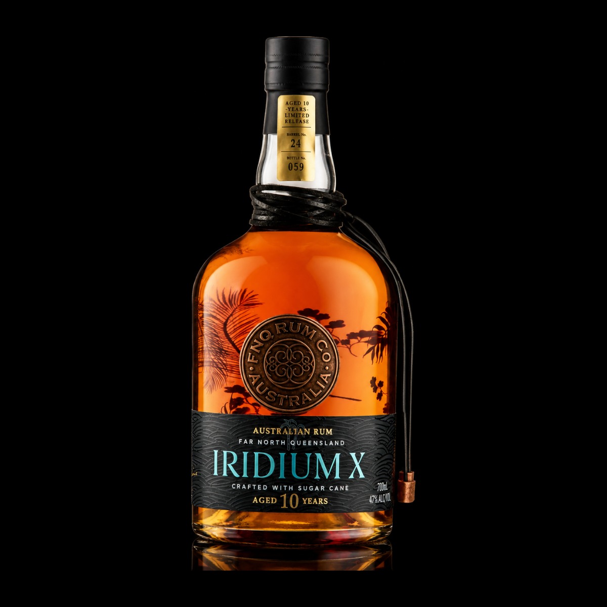
Iridium X
Dried fig, dark toffee, cigar box, tannin.
Neat, if you take aged spirits dry.
RRP $190Palladium
Brown sugar, dark berry, clove, heat.
Mixing at strength. Tiki builds.
RRP $150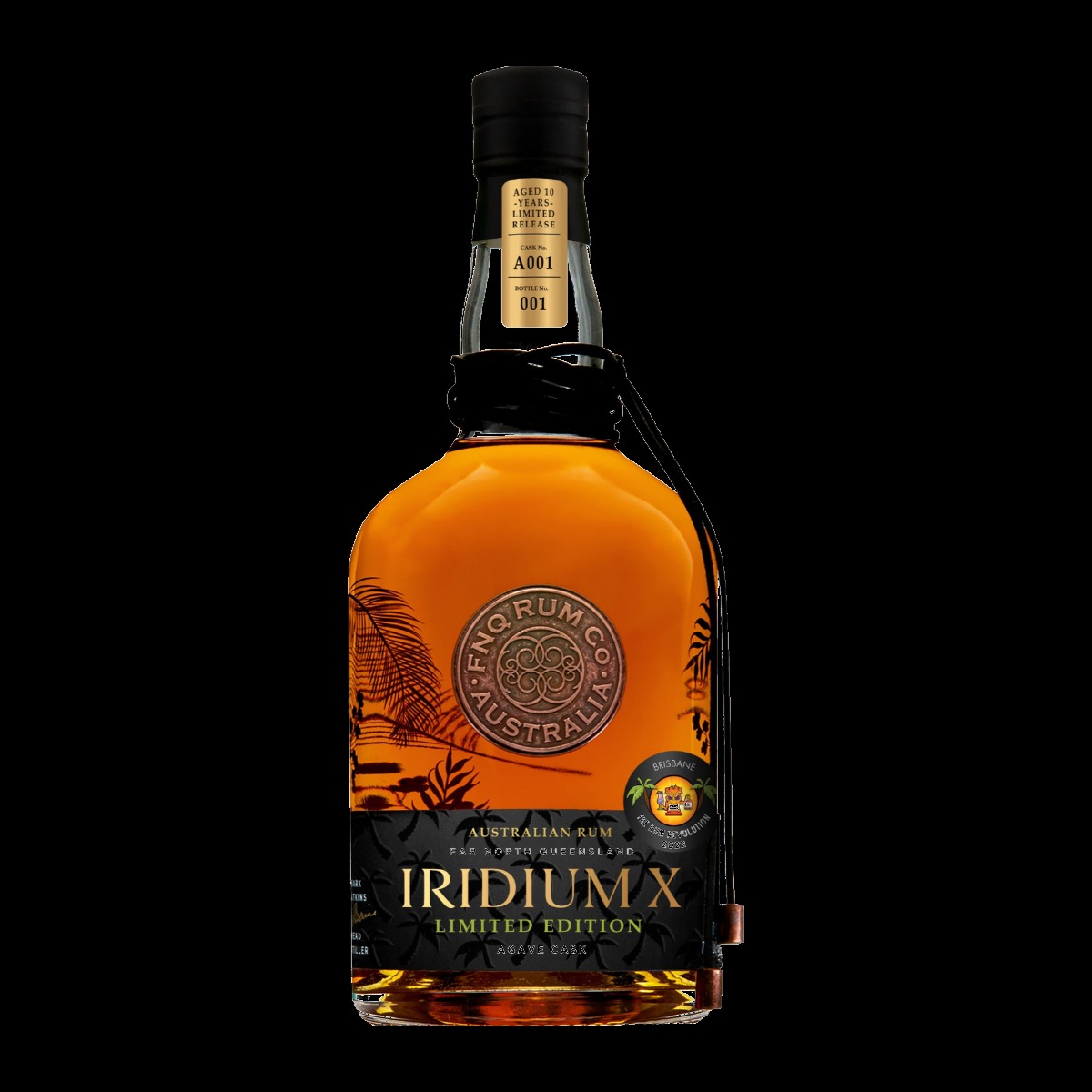
Agave Cask
Roasted agave, green pepper, fig, smoke.
Neat in a tulip, for the curious.
RRP $150Why sugarcane syrup
Most Australian rum is fermented on molasses, the by-product left after a refinery has taken the crystallisable sugar out of the juice. We ferment on locally sourced North Queensland sugarcane syrup instead: cane juice evaporated down to a syrup, stopped before the sugar crystallises out. Water leaves. Nothing else does.
That is a statement about the raw material and the region it comes from, not a claim to be better than anyone else. It is a choice with consequences in both directions, and the consequences are what the rum tastes of.
- 01
North Queensland cane
Grown on volcanic soil at around 700 m on the Atherton Tablelands, cut in season.
- 02
Sugarcane syrup
Crushed to juice, then evaporated to a syrup that keeps its sugars and can be delivered to a distillery that is not standing in a field in September.
- 03
Fermentation
Syrup, water and yeast in a warm-climate ferment. The fruit esters are built here, before a drop of heat is applied.
Fresh cane juice
The pressed juice fermented as it comes. Nothing removed, nothing concentrated.
Green, grassy and volatile. It begins fermenting on its own within hours, so the distillery has to sit in the field and can only run during harvest.
Cane syrup
The whole juice with the water taken out, stopped before the sugar crystallises.
Keeps the sugars molasses has had removed, while being stable enough to store and deliver. Sometimes called cane honey.
Molasses
What is left after a refinery has taken the crystallisable sucrose out of the juice.
Stable, shippable, consistent and inexpensive, which is why the majority of the world's rum is made from it, including many extremely good ones. Proportionally richer in minerals and ash.
None of the three is inherently better than the others. Each has a characteristic flavour direction and a set of practical constraints, and each has produced world-class rum and forgettable rum. What the raw material tells you is what to expect in the glass, not how good it will be.
One copper pot still, and her name is Helga
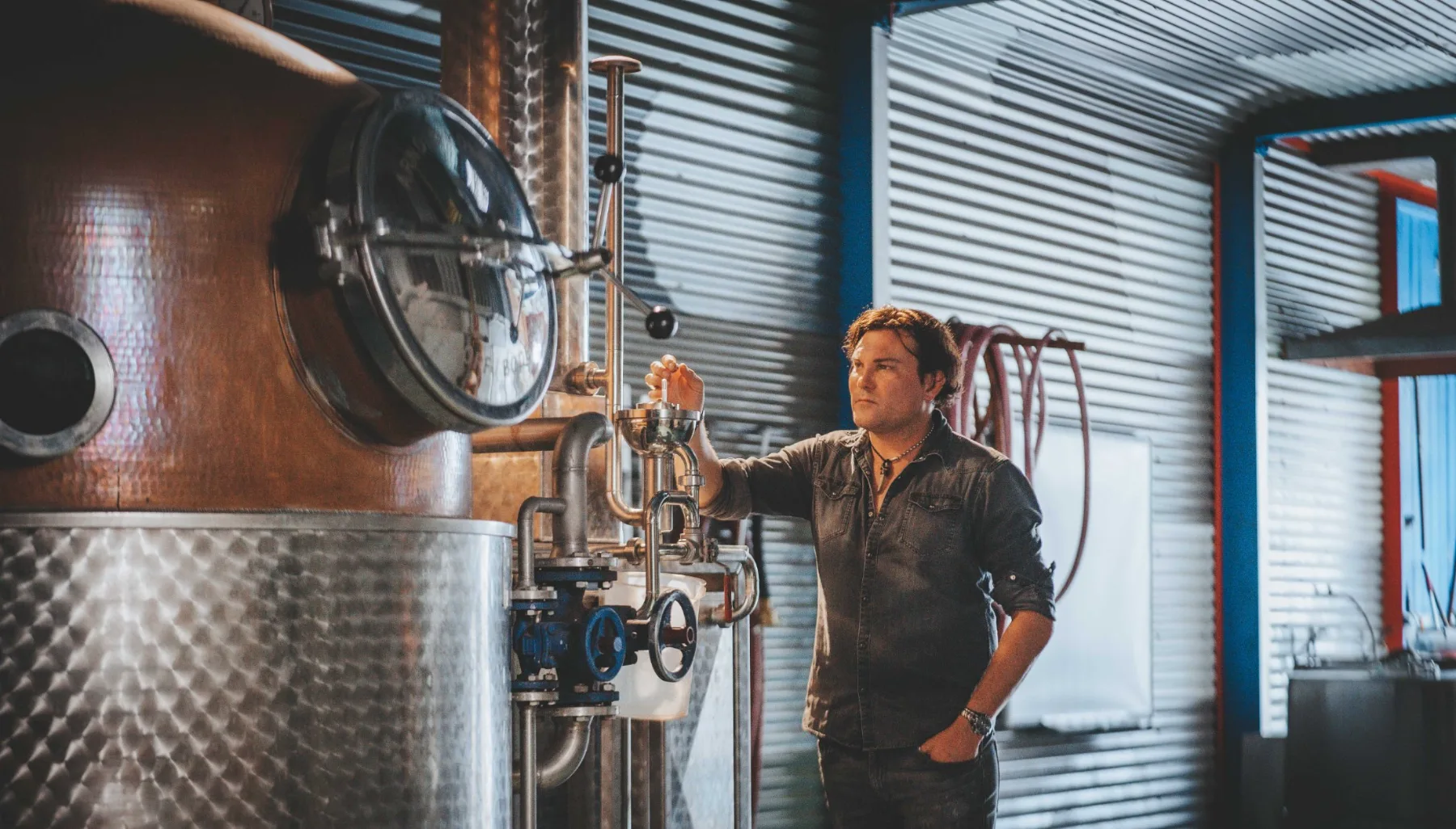
Everything FNQ Rum Co. has released came off the same still: Helga, a 1500-litre Arnold Holstein copper pot at Walkamin. The rum is pot distilled, so the spirit is never run down towards neutral and rebuilt. Whatever the ferment made, the still has to carry.
Copper is doing chemistry rather than decoration: it takes sulphur compounds out of the vapour, which is what lets a pot-still rum be heavy without being harsh. The cuts, where the heads stop and the heart begins, are called by nose at the spirit safe.
- Still
- Helga
- Maker
- Arnold Holstein
- Capacity
- 1500 L
- Configuration
- Copper pot, plated column above
- Distillation
- Pot distilled
- Cuts
- Called by nose
- Passes · plate setting
- Not published
Helga is a pot with a plated column above her, which is how Arnold Holstein builds them, and the sight glasses are visible in the photograph on the process page. How those plates are set for a given run, and how many passes each expression takes, are not published: the fill sheets have not been read against them.
The barrel room never gets a winter
Spirit goes into oak at cask strength and sits in a shed on the Tablelands, where the temperature moves through the day and the humidity sits above 70% for most of the year. Warm wood and moving air mean more contact between spirit and cask, and more evaporation: the angel's share here is expensive, and it is a cost rather than a trick.
We do not publish tropical age equivalencies. A year in this barrel room is not a stated number of years anywhere else. Heat accelerates some reactions and not others, so warm maturation gives a different result, not a shortcut through a cooler one. The age on the label is years in the cask, and it is the youngest spirit in the bottle.
Not every expression is matured. Platinum is bottled unaged, so there is no oak between you and the cane.
Every claim carries its record
The Disclosure Standard · the Barrel Register
An award verifies one liquid in one year. So it is only ever published with the competition, the year and the exact expression that was entered, attached to that release rather than to the brand.
Where the competition record and our own paperwork disagree, the claim stays off the site until the competition record settles it. That rule is currently costing us claims we would rather be making, which is the point of having it.
The number on your bottle is a record
Every barrel we fill gets a permanent record: what went in, which cask, when it was drawn, and how it tasted every time we tasted it. Including the barrels that never made it to a label. Records open as each one is verified against the fill sheets.
- Identifier
- Permanent, never re-used
- Printed on label as
- The label string, verbatim
- Origin
- Syrup batch and distillation run
- Fill
- Date, strength and volume
- Sensory history
- Every draw, dated and signed
- Verification
- Signed before publication
Rum, finished in an agave cask
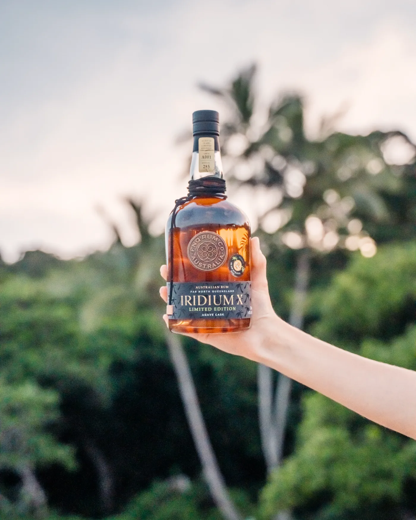
One barrel of ten-year-old Iridium X, moved into a cask that had previously held an agave spirit, and bottled as rum. The wood carries a few litres of the previous occupant, and what tends to arrive is the vegetal, peppery side of agave rather than any sweetness. It reads drier than the rum that went in.
Rum, finished in an agave cask. Not tequila. Not mezcal. Not an agave spirit, and not a blend of one with rum. Not Agave Australis, which is a different Mt Uncle product entirely. No agave is fermented and none is distilled here.
240 bottles, released and sold through. What the cask previously held, where it came from, its volume and the length of the finish are not published, because none of the four is yet verified against a production record.
Everything in the bottle comes from within an hour of the still
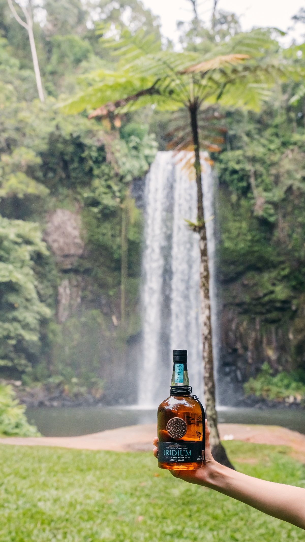
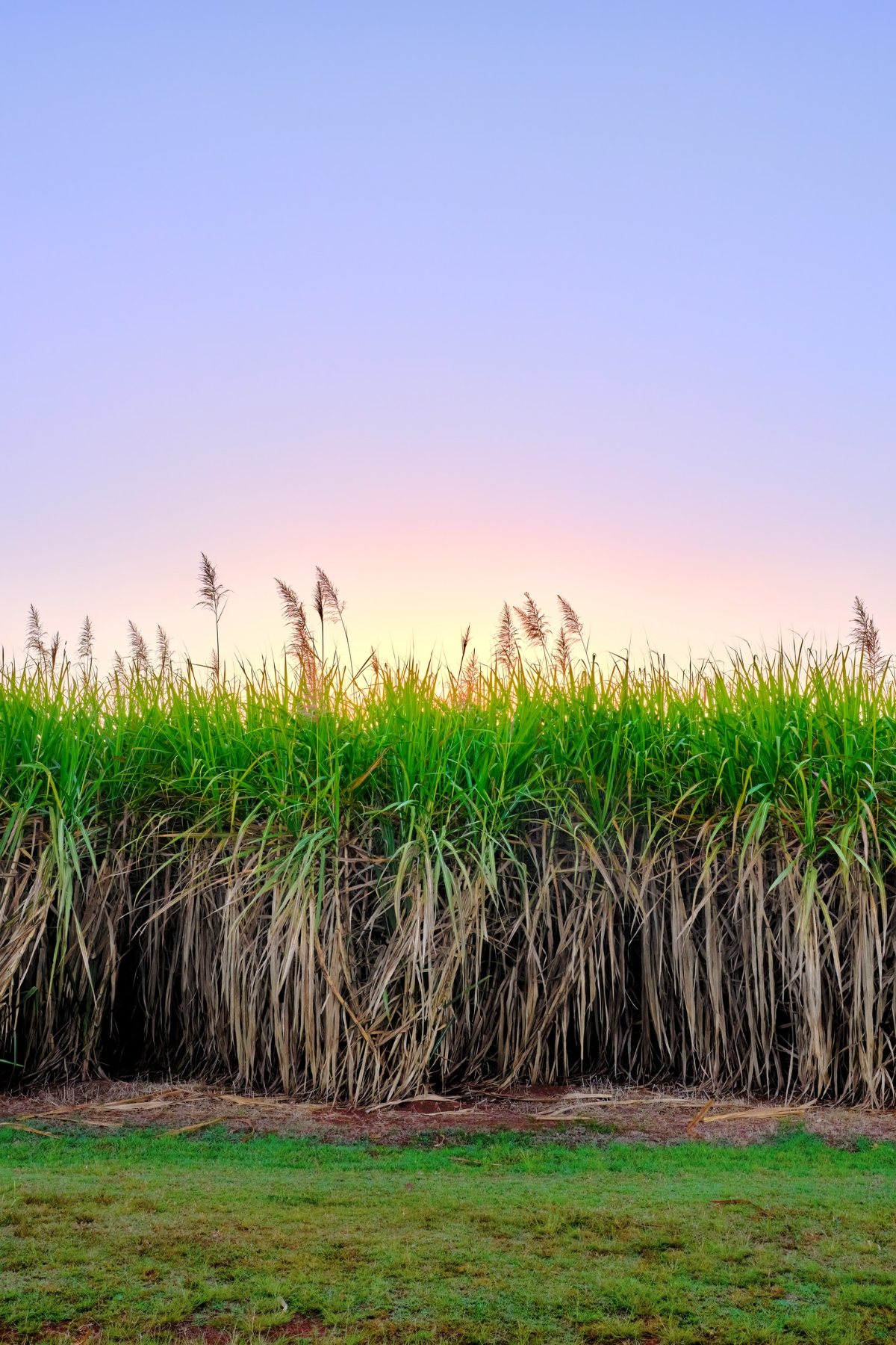
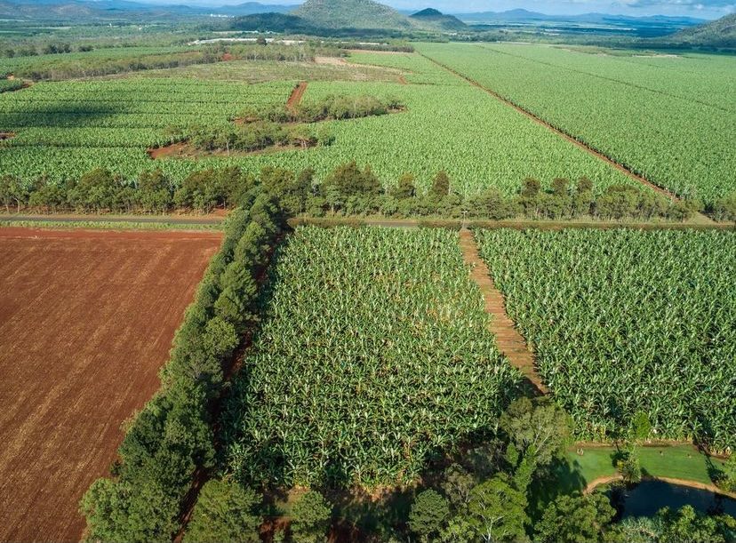
We fill at cask strength and wait.Mark Watkins · Head Distiller
Mt Uncle sits at Walkamin on the Atherton Tablelands, an hour inland from Cairns. The cellar door pours tastings and cocktails in front of the barrel room the rum is made in.
Buy it, pour it, or come and taste it
Mt Uncle Distillery holds current stock, pricing and shipping for every release.
Bars and bottle shopsFind a stockistWhere the range is poured and sold, and how to ask a venue to carry it.
TradeRange it in your venuePortfolio, specifications, application by expression and the trade enquiry line.
Cellar doorVisit Mt UncleTastings and cocktails at Walkamin, in front of the barrel room. Open seven days.